BOOK DESIGN
Book design for London 2012
Olympic and Paralympic Games
The London 2012 Olympic and Paralympic Games had a bold brand and huge marketing campaign which dominated the UK leading up to hosting the games.
While vibrant colours and intersecting lines were brilliant on outdoor advertising and clothing, our challenge was to calm it down slightly to work in books without distracting the reader. We officially got a colour added to the approved Olympic colour palette! After wading through the 160 page brand guidelines, Goldust Design designed 5 of the 9 official books with approved publisher John Wiley.
Here are two of our favourites...
.jpg)
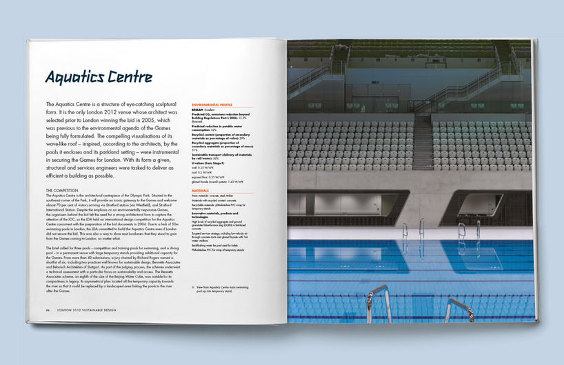
London 2012 Sustainable Design: Delivering a Games legacy
Publisher: John Wiley & Sons
London 2012 explores how environmental thinking has informed all aspects of staging and planning the Olympic games—from transportation to entertainment and nowhere more than in the design of specific venues.
Book design: what we did
The book is large format and packed with architects plans, diagrams and stunning photographs of the Games’ venues. Goldust Design laid out the whole book in top secret while the park was under construction, balancing the pace of the technical diagrams with large colour photographs to add visual impact. London 2012’s sustainability legacy lives on and, years later, we are delighted the book does too.

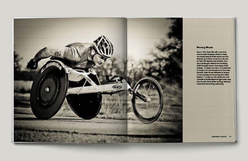
Power & Movement: Portraits of Britain’s Paralympic Athletes
WINNER British Book Design and Production Award:
Photographic Books Art /Architecture Monographs
BBD&PA Judge's comment: ‘This is a photographic collection that captures the essence of sporting endeavour in a consistently stunning series of sepia images. The layout, text and packaging come together to create a first-rate book.’
Book design: overview
In designing this large coffee table book of stunning portraits of paralympic athletes, our job was to choose images with the photographer, Richard Booth, and create a spacious elegant design to quietly show them off at their very best.

.jpg)
Book design: what we did
Using fonts from the 2012 Olympic Games brand guidelines, we designed a style for the book package, from cover to cover. We created a flat plan and laid out the book, varying the pace through image positioning, pull quotes, double page spreads and careful use of the chic colour palette.


